In the promotional flyer below you can see the CHOICE ethos in action. Part of the idea here is that we are all using our phones for all things so having a QR code as the single point of contact removes complexity and helps eliminate friction between the customer and the business. It would be interesting to do an A/B test to see if the CHOICE QR code generates more sales versus a flyer without one.
The copy is designed to be personable - it could have read “Steak and Fries Delivered 24/7” - instead it says “Steak and Fries Delivered to Your Door 24/7”, emphasizing the personal relationship with the customer.
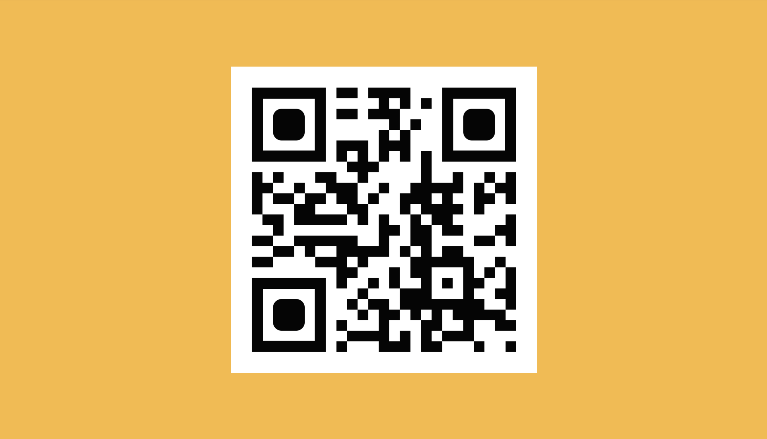
The flyer is dominated by a QR code that in the real world would take you to the CHOICE restaurant website with restaurant delivery hours, menu, contact details etc., (this is a real QR code generated for this project - as a placeholder it goes to the homepage of this website. To activate it point your phone’s camera at the code, it should then automatically give you the option to go to the website.
The QR code also works in a thematic way - the CHOICE restaurant only has two menu items, a QR code only has two colors, black and white, and is digital culture personified - it is comprised of “bits”, black squares that are only “on or off”, only two choices.
The flyer is designed to emphasize the Brand Prism seen after the promotional flyer; the simplicity of the flyer and deliberate lack of lots of copy conveys the brand’s culture and personality.